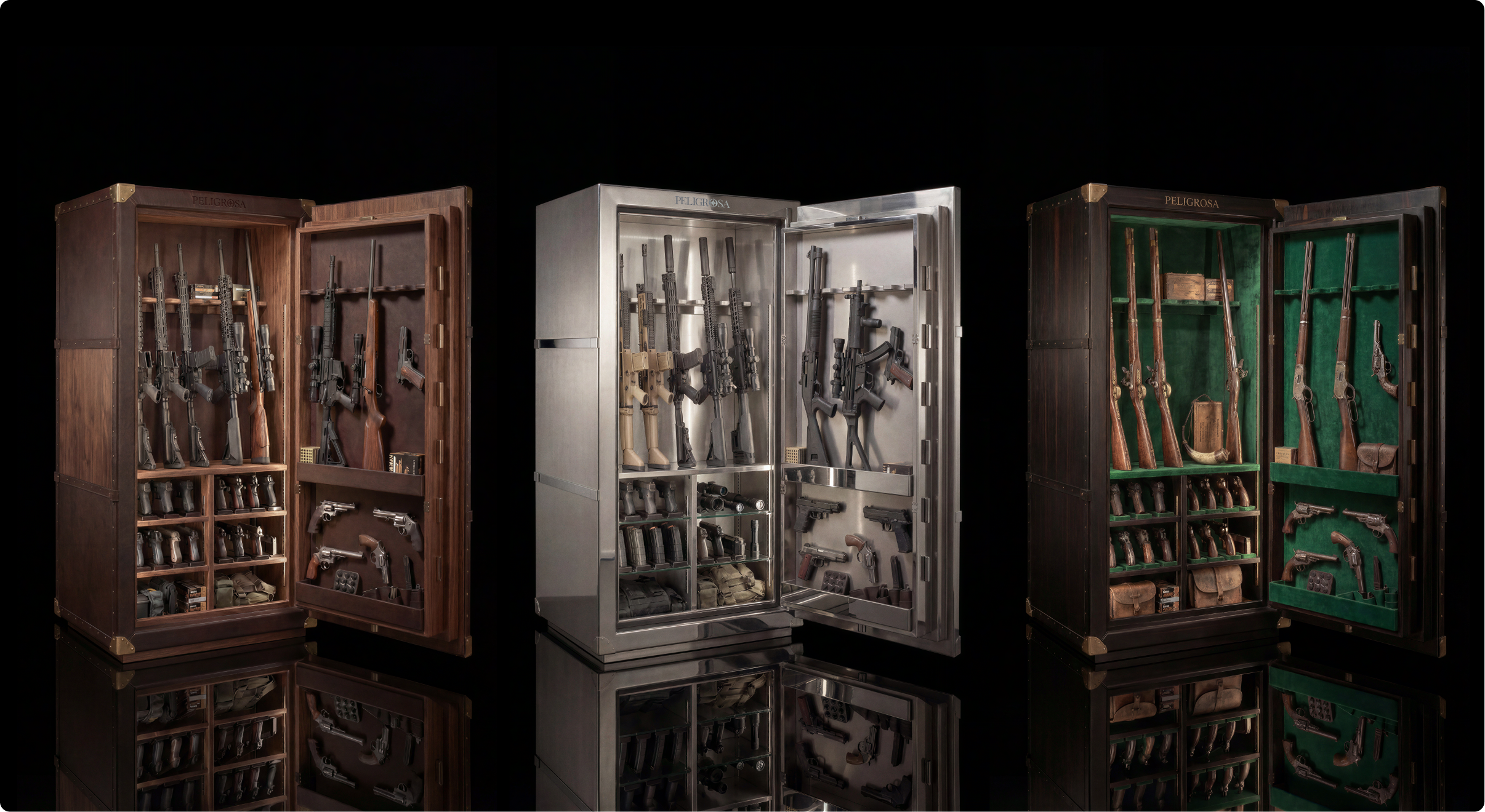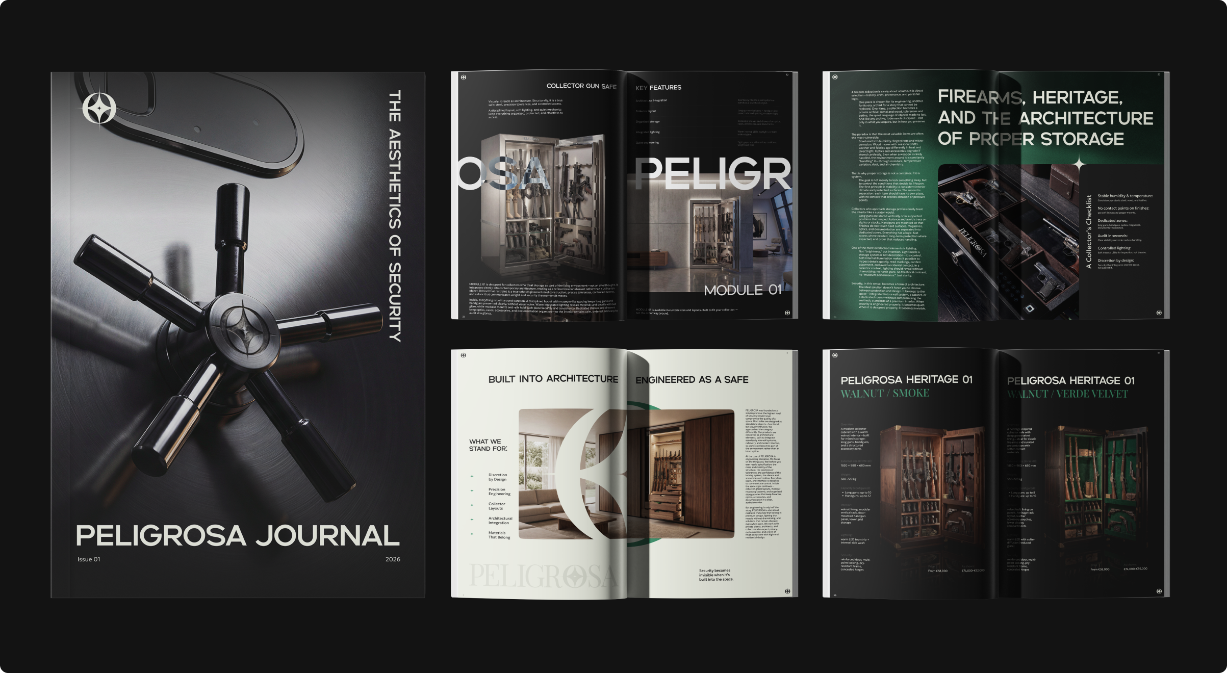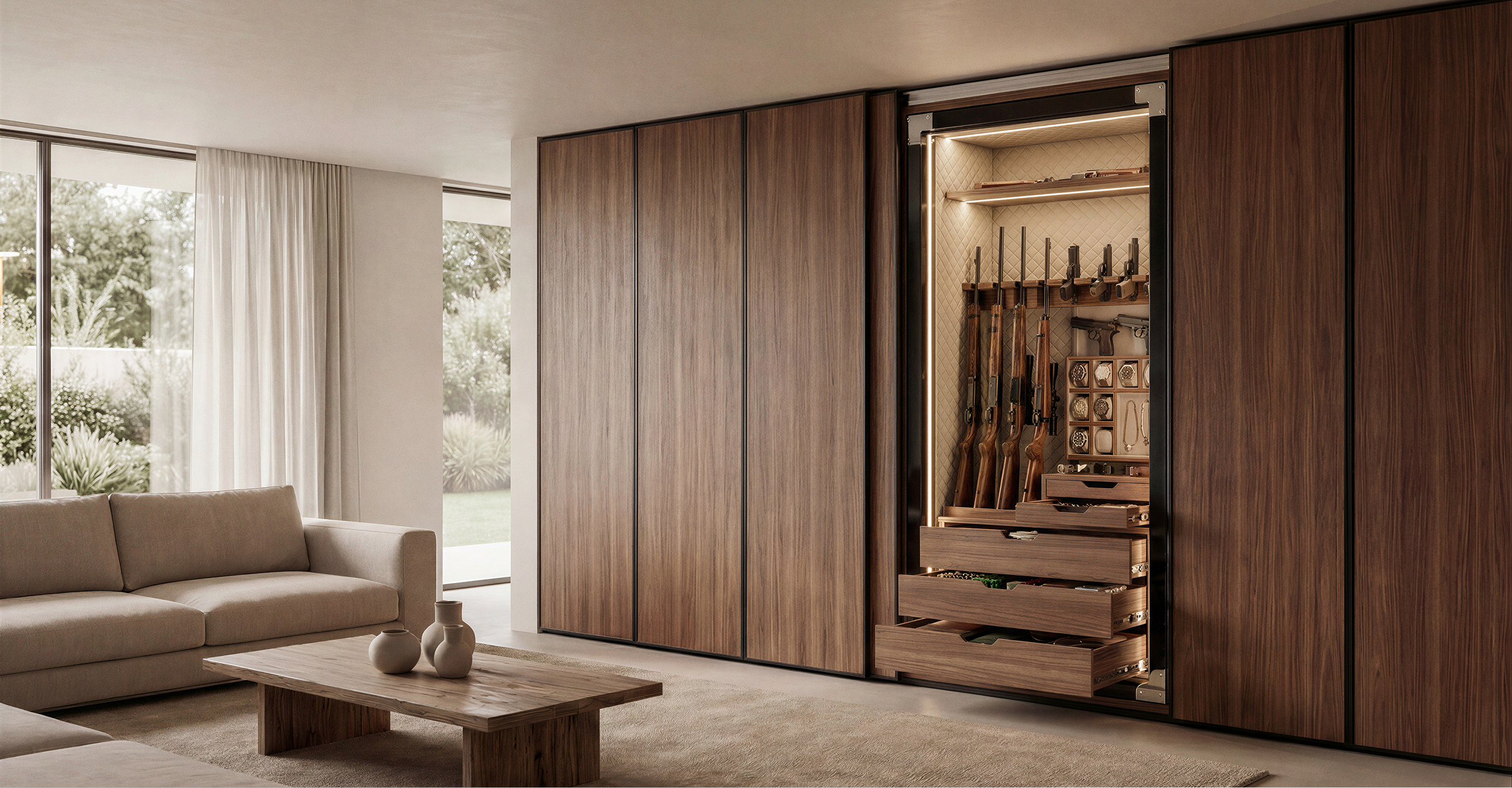
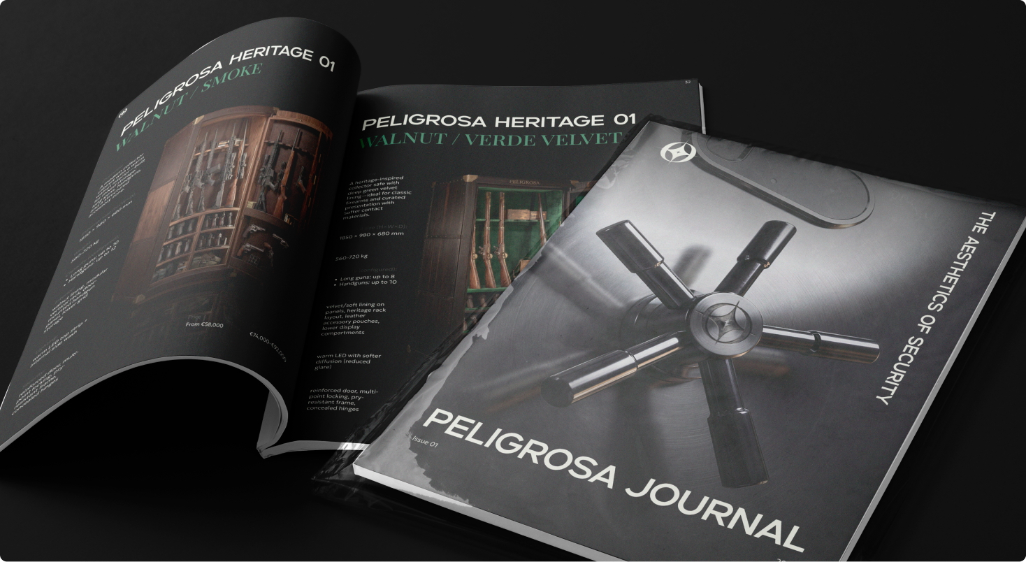
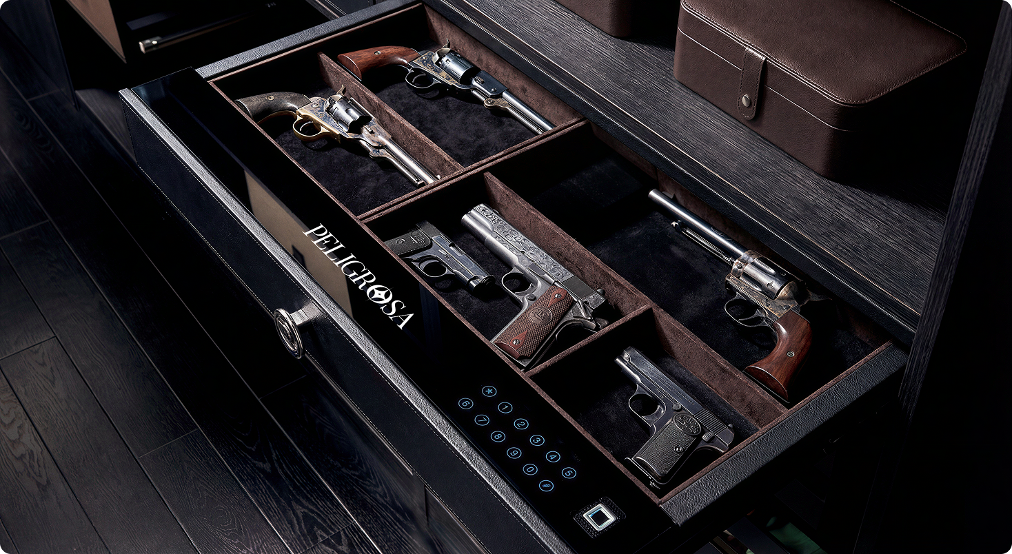
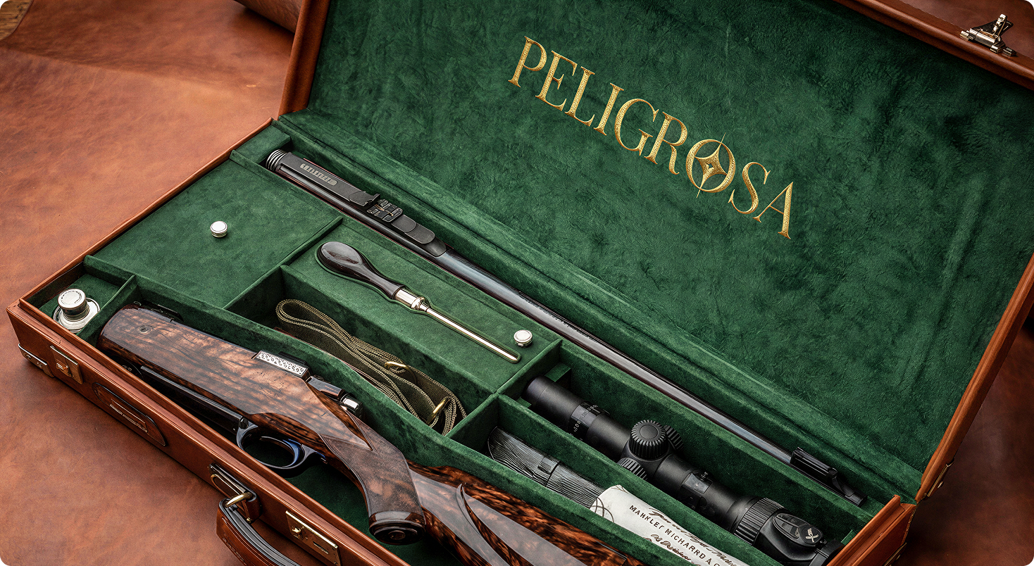
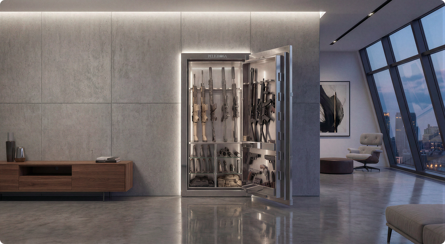
Peligrosa crafts one-of-one safes as art pieces within architecture – not metal to hide, but meaning to display. We turned security into an interior art language: a calm serif wordmark, the «Guardian Star» emblem, deep velvet green with brushed steel, and watchmaking-level photography. A collector catalog, biannual journal, numbered certificates and photoreal CGI complete a world where a safe reads as a gallery object.
task & context
A boutique brand of one-of-one safes for UHNW homes and private offices.
The product must read as interior art – not hardware – and be sold through trust-based, private channels.
Task
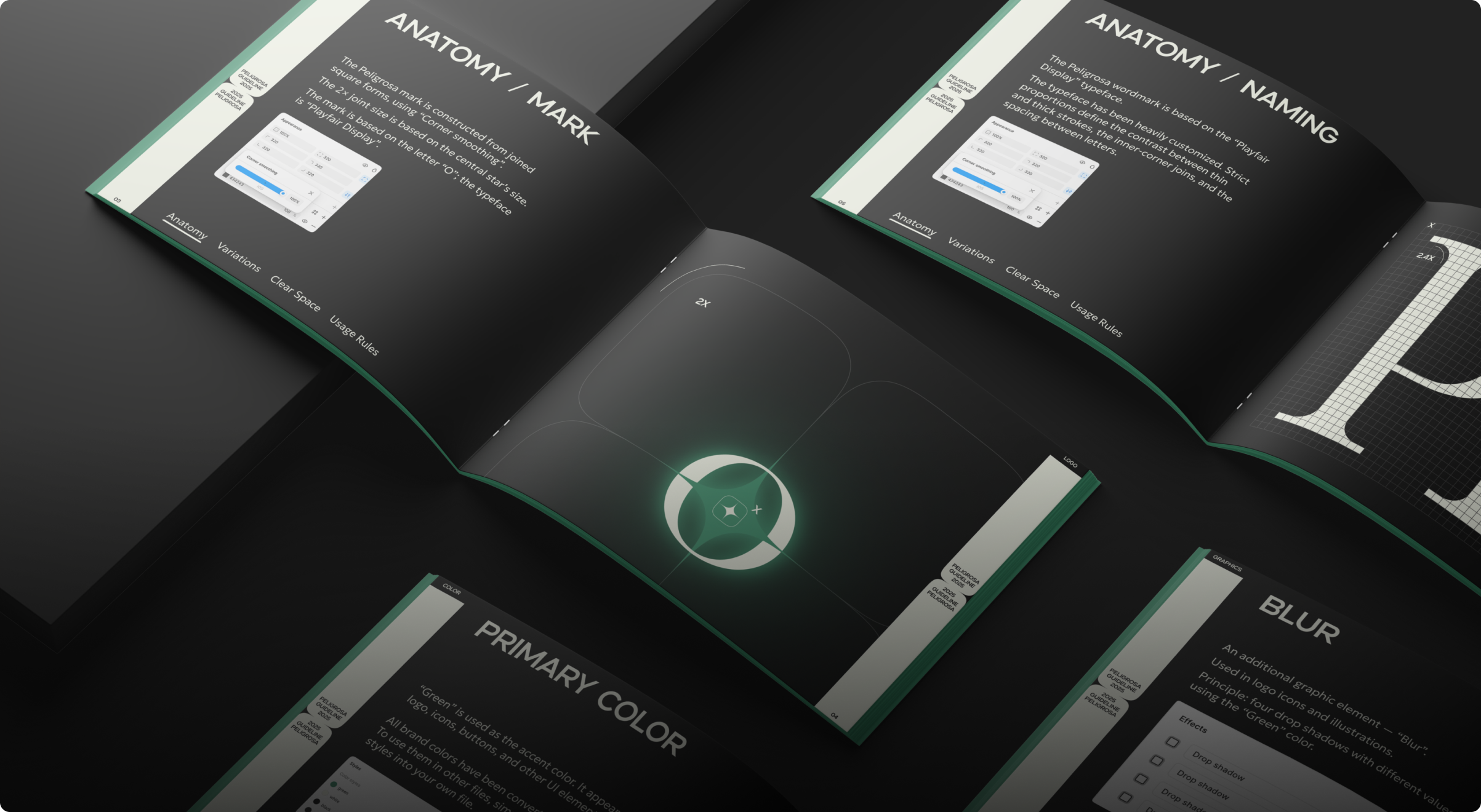
• Build a complete identity system – wordmark, emblem, typography, palette, print
• Define the narrative “The Safe as Interior Art” – tone of voice and messaging
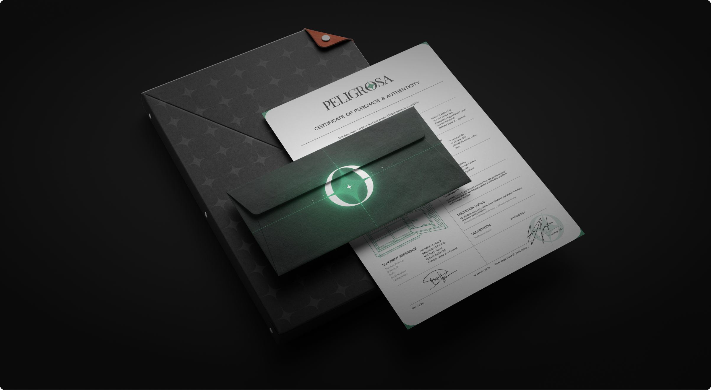
• Create premium tactile artifacts – catalog, biannual journal, numbered certificates
• Produce photoreal CGI that conveys presence without aggression
• Prepare bilingual launch assets for Asia/EMEA
Context
• Dual audience with different decision cycles – spec vs. desire
• NDA-heavy category – discreet communications, no functional disclosure
• Market norms and labeling differ by region – compliance without visual noise
• Bespoke production and white-glove installation – long lead times, precision fits
• Visual codes must avoid “tactical/military”; choose calm, gallery-grade luxury
idea & concept
Key idea
«The Safe as Interior Art»
Security that looks like it belongs – a crafted object that adds calm, value and presence to a room.
Concept
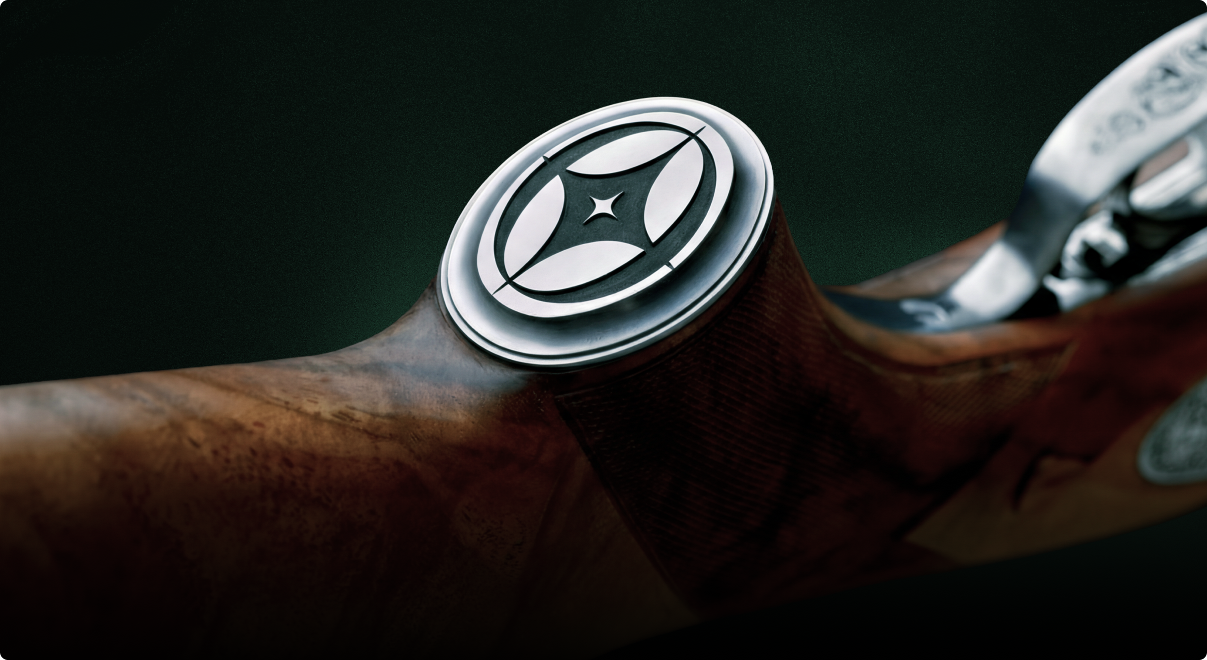
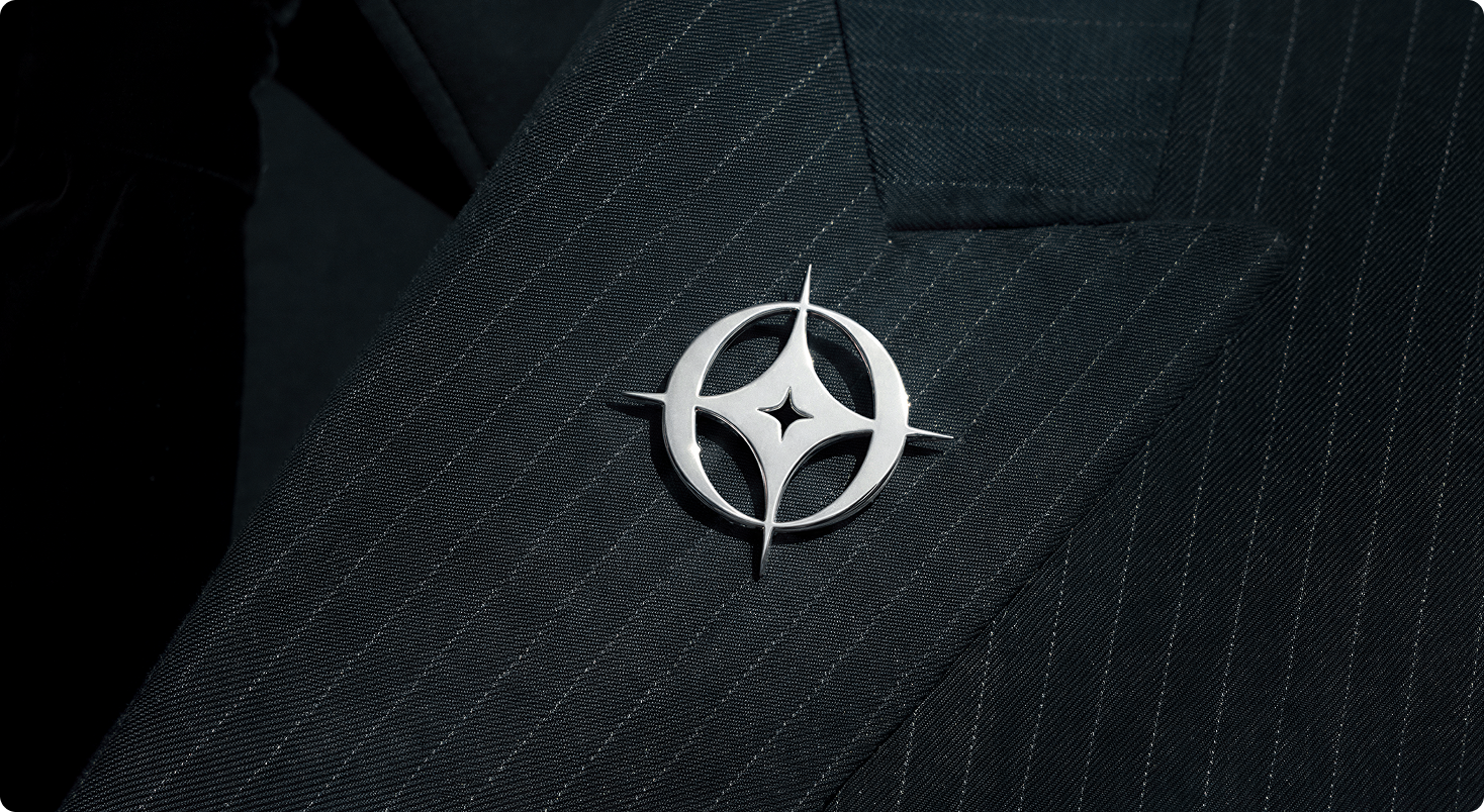
Emblem
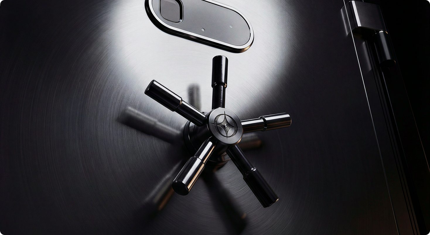
The «guardian star» – four cardinal points around a calm core, символ энергии и контроля.
Typography
A customized high-contrast serif with softened terminals – status without aggression; for body copy – a neutral grotesk (sans serif) for readability.
Palette & materials
Brushed steel, obsidian black, deep velvet green, walnut accents.
Print
Blind deboss + silver hot-foil, плотные бумаги с мягкой фактурой.
Photography
Mechanisms сняты как haute horlogerie – точность, свет, тишина.